


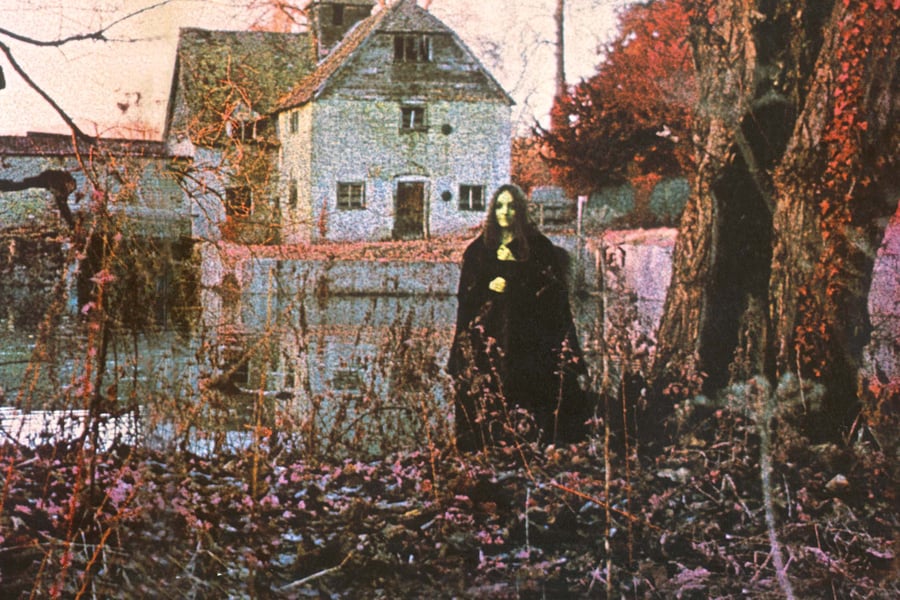
The cover of Black Sabbath’s self-titled debut, which came out 50 years ago today, has become one of rock’s most iconic and captivating album sleeves. A witchy-looking woman stands alone in the woods in a haunted underworld, staring out at you, clutching something — her cloak? a cat?
When listeners opened the gatefold sleeve, before even dropping the needle on the LP, they saw an inverted cross that contained not only the songs and credits, but also an unnerving poem. Among other nasty visuals, the text describes severed bird wings, poppies that bleed, and “mute birds, tired of repeating yesterday’s terrors,” all leading up to a line about how “by the lake a young girl waits, unseeing she believes herself unseen, she smiles, faintly at the distant tolling bell, and the still falling rain.” The imagery was as evocative as it was provocative.
And then you played the music, hearing Tony Iommi’s crushing riffs and Ozzy Osbourne’s terrifying tableaus of horror. Black Sabbath was the perfect example of music and cover art in complete synergy.
For a half-century, mystery has surrounded the Black Sabbath sleeve. All fans had to go on was a credit that said, “Album designed and photographed by Keef,” a name that would also appear on the next three Black Sabbath albums. But “Keef,” whose real name is Keith Macmillan, has never voluntarily agreed to an interview. In addition to the first four Black Sabbath LPs, he shot classic album covers for David Bowie and Rod Stewart, and videos for Kate Bush and Motörhead, among many other projects. When Rolling Stone reached out to him, asking to discuss Black Sabbath for its anniversary, he changed his mind. “I’m very happy just to do this for Sabbath, really,” he says.
At the time of the Black Sabbath sleeve, Macmillan was still new to his job as the in-house album designer for Vertigo Records, a U.K. imprint of Philips. He had met the label’s president, Olav Wyper, when Wyper worked at CBS Records. Macmillan, who had been taking pictures since he was eight years old, was studying photography at London’s Royal College of Art and had agreed to assist with a black-and-white promo video Wyper was producing for Fleetwood Mac’s “Albatross.” Macmillan met Wyper at a pub, where the record exec asked to see some of the photographer’s pictures. “He was being very kind,” Macmillan says with a laugh. “He was like, ‘Oh, yeah, these are cool,’ ’cause they were quite surrealistic.” When Wyper moved from CBS to Vertigo, he offered Macmillan a job.
“His work was just fantastic and very different from everybody else’s,” says Wyper.
Prior to his time in the record business, Wyper had worked in advertising and knew that an album’s cover was important, so “very, very strong imagery,” as he puts it, was part of his business plan for Vertigo. The imprint would feature “progressive” music, which by Wyper’s definition included rock, jazz, and folk — “but it all had to be contemporary.” So in addition to undeniably prog-rock records by groups like Colosseum and Manfred Mann Chapter Three, the first six releases included Rod Stewart’s solo debut, An Old Raincoat Won’t Ever Let You Down, and Black Sabbath.
Love Music?
Get your daily dose of everything happening in Australian/New Zealand music and globally.
“The music had to reflect what was going on, socially, in the country at that time,” Wyper says. “We were very fortunate with Black Sabbath, because that is largely credited by many people as being the first heavy-metal album. I don’t think it is, but it was probably the first one that went ’round the world the way it did.”

Courtesy of Rhino
Macmillan began his work on Black Sabbath by playing the album off a quarter-inch master tape. “If I remember rightly, I just listened to the music,” he says. “Obviously, the lyrics go in the back of your mind, but it was more just the overall vibe that struck me. Sorry to talk like an old hippie, but you have to go with a kind of overall feel for the art.” He says that the album expanded his musical horizons: “To be honest with you, it was the first time I really enjoyed that kind of heavy rock, metal. I wasn’t really into it before, but that album made me a fan for life.”
Luckily for Macmillan, Wyper had given him the latitude to do whatever moved him for the Black Sabbath sleeve, as long as it was interesting. The photographer, still fresh out of the Royal College, had recently discovered surrealism, so he drew on that movement for his designs. “The biggest influence on my photography was a visit to an exhibition by the Belgian surrealist René Magritte at the Tate Gallery in London in early 1969,” he says. “It is no exaggeration to say that I entered a visual virgin, and two hours later emerged transformed and inspired.” So when the time came to create something for Black Sabbath, less than a year after his museum visit, he had a deep well of ideas.
For the look of the cover, he used Kodak infrared aerochrome film, which was designed for aerial photographs and gave the portrait its pinkish hue. (You can see a similar look on the first album cover he designed, Colosseum’s Valentyne Suite.) Later on, he did “a little bit of tweaking in the chemistry to get that slightly dark, surrealistic, evil kind of feeling to it.” Since it was sensitive film, he’d boil it and then freeze it, to make the image grainy and undefined.
He decided the shoot should take place at the Mapledurham Watermill, a 15th-century structure in Oxfordshire, about an 80-minute drive from central London. He’d found it with one of his college girlfriends, who lived near it, and had remembered taking a walk around it. “Nowadays it’s very much more modernized, beautified, and touristed,” he says “Then, it was quite a run-down and quite spooky place. The undergrowth was quite thick and quite tangled, and it just had a kind of eerie feel to it.”
He contacted a London model agency, asking for a woman who could portray the ominous figure he’d envisaged for the shot, and picked out Louisa Livingstone. “She was a fantastic model,” he says. “She was quite petite, very, very cooperative. I wanted someone petite because it just gave the landscape a bit more grandeur. It made everything else look big.”
Livingstone is five feet tall and has always had brown hair with a reddish tint. She grew up between London and Paris, which sounds ideal, but which she says was “unpleasant” because she always had to relearn the language of wherever she was. In the late Sixties, she started modeling for Annie Walker, which she says was the first agency in London whose models would pose nude in a tasteful way. She was 18 or 19 years old at the time of the Black Sabbath shoot.
Her most vivid memory of that day is just how cold and dark it was; neither the photographer nor model remember exactly when the shoot took place, but it had to be sometime between the November 1969 sessions for the album and its February 1970 release date. In order to capture the infrared light for his film, Macmillan wanted to get to Mapledurham as early as possible. “I had to get up at about four o’clock in the morning, or something as ridiculously early as that,” Livingstone says. “It was absolutely freezing. I remember Keith rushing around with dry ice, throwing that into the pond nearby, and that didn’t seem to be working very well, so he was using a smoke machine. But it was just one of those very cold English mornings.”
To add to the vibe, Macmillan had brought some props with him to the shoot. One was a taxidermy crow, which he placed on a tree stump that’s on the album’s back cover. “We had him wired onto a tree,” he says. “His name is Yorick. He used to sit in my studio.” The other, he says, was a live black cat, which he says Livingstone is holding. However, she doesn’t remember a cat. “I think it might just be the way my hands are there,” Livingstone says. “I’m sure I could remember if it was a cat.”
“I think I borrowed it from a friend,” Macmillan says. “It was a little black cat.”
In either case, the reason why Livingstone’s hands are where they are in the photo is because she was trying to keep warm. All she was wearing for the shoot was a long, heavy velvet cloak. “We were doing things that were slightly more risqué, but basically we decided none of that worked, really,” Macmillan recalls of some alternate setups. “Any kind of sexuality took away from the foreboding mood. But she was a terrific model. She had amazing courage and understanding of what I was trying to do.”
But the photographer adds that he didn’t give Livingstone much to go on either. “As a photographer, I tend to just set the mood,” he says. “And if you’ve got a model who understands the mood, rather than specific direction, then you tend to get a more naturalistic effect. If you over-direct, as a photographer, in my opinion, it looks a little more staged. And I think one of the charms of that album, it just looks snapped. It just looks like an instant of something that was actually going on.”
Macmillan says he doesn’t remember having any other concepts for the Black Sabbath sleeve and that he doesn’t have any outtakes from the shoot. Once the photo was done, work began on the rest of the packaging. One of his fellow students from the Royal College of Art, Sandy Field, designed the typography for the Black Sabbath logo, as well as the inverted cross. “As far as I recall, the idea of the upside-down cross was partially because it provided a strong graphic image to frame the poem and credits, and partially to bring a sense of the occult to the design,” Macmillan says. “It was not intended to be anti-Christian or satanic. After all, the inverted cross is often referred to as St. Peter’s Cross.”
But what was sinister about the design was the poem that went inside it. His photographic assistant, Roger Brown, decided to take a stab at writing the text. “I met Roger through Sandy Field,” Macmillan says. “Roger was at art college with Adrian Field, Sandy’s brother. We worked together, on and off, for many years. Roger had a great imagination, both with visuals and with words. He was a contrarian at heart and was never afraid of initiating controversy. Perfect for the Sabbath poem.”
With the package complete, Wyper had the inspired idea of releasing Black Sabbath on February 13th, 1970 — a Friday the 13th. “Friday the 13th is supposed to be a day in England when you don’t go out,” Wyper says. “You don’t take any risks. Stay at home. It’s a bad day. Terrible things could happen. So it was quite deliberate.” (Incidentally, the release date was also Macmillan’s 23rd birthday.)
The band had recorded the album in a whirlwind two-day session and then gone right back on tour. No one at Vertigo asked them for their input on the art, so they were quite surprised when their manager first presented them with the full LP package shortly before its release.
“We really liked it, the album sleeve,” Black Sabbath guitarist Tony Iommi says of Macmillan’s handiwork. “We liked everything at first, it was really exciting because we’d finally got an album out and everything was exciting.”
“I love the front cover,” Black Sabbath’s drummer, Bill Ward, says. “I thought it was mysterious. It’s kind of like where we kind of hung our hats, to be honest with you. All that was fantastic to me. I hated when I opened up the middle part and somebody put an upside-down cross in it. I hated that because that wasn’t who we were. And nobody had talked to the band about that.… I think that they wanted a certain image, or they wanted it to be a certain way. I don’t know what they thought. But it gave us an image that we fought in the press over for maybe four or five years.”
“When I saw the cover, I thought it was quite interesting, but I thought, ‘Well, that could be anybody,’ so it’s not like I got any kind of ego buzz out of it,” Livingstone says. “But, yeah, I thought it was a very nice cover.”
Sometime after the album’s release, a woman came to one of Black Sabbath’s concerts and attempted to impress them by saying she was the cover model. “We didn’t know who she was,” Iommi says. “She said, ‘I was the girl on the front cover.’ ‘Oh, right.’ But I don’t remember what she said.”
Livingstone says that whoever that woman was, it wasn’t her. “Black Sabbath is just not my kind of music,” she says. “I feel awful for saying it, because it’s probably not what people want to hear, but it isn’t particularly my kind of music. When I got the album, I gave it a listen and moved on.” Her favorite groups at the time included the Rolling Stones, Beatles, Cream, Traffic, and the Doors.
When the shoot was done, Livingstone returned to her career in modeling and acting. “My size meant I could play very young girls in a teenage setting,” she says. “I was playing a 13-year-old when I was about 27.” She appeared on the covers and in art for Fair Weather’s Beginning From an End (shot by Macmillan) and Queen’s Jazz, and she worked at the National Theatre in London and appeared on television and in films. “I was in one particular thing called Kids, for London weekend television, and it was shown all over the country,” she says. “It was the peak of fame. People were recognizing me in the streets for about a week, so I had a taste of fame for about a week.”
Has she ever been recognized for posing on the cover of Black Sabbath? “I don’t get recognized at all,” she says, adding that a friend only recently told her about the album’s cult status.
After acting, she studied at the Faculty of Astrological Studies in London. She now lives in Europe, where she makes electronic music under the name Indreba. “I’ve found it very therapeutic to make the music, but I’ve never done anything to try and sell it,” she says. “It seems like a very hard business to break into.”
The Black Sabbath album quickly became a hit, thanks to word of mouth and curiosity sparked by its cover, and within a few months it peaked at Number Eight on the U.K. record chart. Vertigo saw they had a hit and asked the group to make another LP quickly. “Releasing an album a year is fine when you’re already established, but here was a band that had come from nowhere overnight almost, and they had created a huge fan base both here and in Germany,” Wyper says. “In order to cement their position, we had to get a new album out much more quickly than people normally did.”
“Was I surprised Black Sabbath was a hit? No, because they had the magic,” Macmillan says. “They had whatever it is that makes things work in life. I was surprised by the fact that that they got as big as they did. But that they were successful? No. The timing was right.”
Luckily for Black Sabbath, they already had material for another album. A log sheet from one of the recording sessions for Black Sabbath shows that they had already written “Fairies Wear Boots,” a stomping indictment of belligerent skinheads, at the time of their first album; the track would later close out what would become Paranoid. And bassist Geezer Butler recalls that the band had all the music, but no lyrics, to what would be the album’s opening cut, “War Pigs.”
That song, which blasted politicians for sending their children off to die at the peak of the Vietnam War, runs nearly eight minutes, and closes with a dizzying pyrotechnic display of guitar. It seemed epic enough for an album title, and the band got to work on the record. Because the label wanted to rush out the follow-up as quickly as possible, it relayed the War Pigs title to Macmillan, who got to work making test shots.
“I don’t think we had the music at that point,” he says. “I seem to remember it being a bit of a rush and that they needed something quickly, so we just went and did it.”
He took his photo assistant, Roger Brown, to Black Park, which he describes as the backlot of Pinewood Studios, near Slough, where Dr. No and many of the other James Bond movies were made. “That was my go-to location for things like that,” he says. They had visited a local props shop and gotten Brown everything he needed to be a “war pig”: a sword, a shield, and a pig mask, though any shots of him in a mask no longer survive.
“We shot it at night, and we did quite a lot of experimental stuff,” Macmillan says. “We used ultraviolet light and an ultraviolet flash, so everything was fluorescing, basically. Some of the pig-mask pictures were much stronger than that particular image [on the cover]. I don’t find that image very, very strong. I find it quite weak.”
But because, unfortunately, as Macmillan says, “they were in a blind panic to get something out,” someone from the label took his test shots and placed it on the front of the album. To make matters worse, the album title changed.

Courtesy of Rhino
During the War Pigs sessions, the band’s producer, Rodger Bain, asked them if they had one more song in them. Iommi worked up a fast-paced riff, Butler wrote some lyrics about feeling depressed, and they recorded it. Looking back, Butler says he titled the song “Paranoid” — a word that doesn’t appear in the lyrics — because it was just a trendy term at the time. “ ‘Paranoid’ was one of those words of the moment back then, like ‘YOLO’ or whatever it is now,” he once said. “Certain words have become hip with each generation, and ‘paranoid,’ because everybody was smoking dope, was it. It was like, ‘Oh, I’m gettin’ really paranoid when I’m smoking that dope.’ Everybody was going around saying that.”
The “Paranoid” single came out in July and quickly became a hit, and Warner Bros., the band’s U.S. label, decided it was a better album title than War Pigs and requested that the band change it. Ozzy Osbourne remembers seeing sleeves printed up that said War Pigs on the front with the image of Brown, and was horrified when the title was changed to Paranoid.
“You look at the photo and go, ‘What’s fucking paranoid about that?’ ” Osbourne has said. “It’s two guys with shields and swords and pink leotards.”
“Everybody asked, ‘What does this art mean?’ ” Iommi recalled later. “We’d have to go into the story. ‘Well, it was going to be called War Pigs.’ ”
“It’s just slightly embarrassing, to be honest,” Macmillan says of the fact that his War Pigs–themed images ran with the Paranoid title. “There was no way we could do a reshoot. It was just a matter of just getting out there and going with it.”
The inner gatefold contains a photo of the band relaxing in a park that Macmillan shot but has no recollection of taking. “I used to do band shots every day,” he says. “The sleeve photography, the gatefold stuff, is the stuff I remember. Everything else tends to be a little bit of a blur from the Sixties, to be honest.”
Once again Sandy Field did the type treatment with a new Black Sabbath logo and font for Paranoid, and the record went on to become a massive hit when it came out in September 1970, seven months after the release of Black Sabbath. Despite the quizzical album art, it went to Number One in the U.K.
After appearing on the cover of Paranoid, Brown would continue to work with Macmillan for years, even after the photographer transitioned into making music videos. Brown served as the production manager on Macmillan’s videos in the Seventies, and later became an executive producer on dramas for the U.K.’s Channel Four Television. He died of leukemia in 2002 at the age of 55.
Wyper had left Vertigo sometime before Paranoid’s release, but his “strike while the iron is hot” ethos stayed at the imprint. When the label saw the massive reaction to the album, and the fact that the “Paranoid” song was big enough to get the group on Top of the Pops, it once again asked for another album in less than a year’s time.
The band was back in the studio in February 1971, just a year after the release of Black Sabbath, to work on its third album. Once again, the group was able to draw on material it had written early on to round out the track list. Some time when the group was still calling itself Earth, before rechristening itself Black Sabbath, Osbourne and Butler had collaborated on the lyrics to a song called “Changing Phases.” The band turned it into a cosmic ballad and retitled it “Solitude,” placing it before the walloping final song “Into the Void.”
Drummer Ward says Master of Reality is his favorite Black Sabbath album. “We moved into a different place on that one, especially with ‘Children of the Grave,’ ” he says, referring to one heavy-hitting track about war. “It was completely different from what we had done before.” He also points to the lyrics of “After Forever” as challenging the status quo. “I liked the line, ‘Would you like to see the pope on the end of a rope? Do you think he’s a fool?’ ” Ward says. “I like those kinds of lyrics, not because I dislike the pope or religion. I just liked the fact that we had balls enough to say or do something like that. Black Sabbath questioned a lot of things.”
This time, rather than use a photo for the cover, Macmillan designed the Master of Reality sleeve as a stark type treatment. It was created by a graphics-design company that dubbed itself the Bloomsbury Group, a name that echoes that of a set of early-20th-century intellectuals, including Virginia Woolf and E.M. Forster. To make it stand out, Bloomsbury embossed the bubbly lettering for the U.K. release, so that you could feel it with your fingers. The U.S. version, though, was presented flat; in fact, all of the Warner Bros. versions of the early Black Sabbath albums looked cheaper than their U.K. counterparts. Macmillan says he was disappointed to see that the label did a regular sleeve for Black Sabbath, his panorama shot, but was happy that the essence of it still worked.

Courtesy of Rhino
Macmillan’s contribution to Master of Reality was a six-panel fold-out poster of Black Sabbath posing solemnly outside. The sky looks dark and eerie, and the whole image has an otherworldly vibe about it, similar to the pink sky and damaged look of the cover of Black Sabbath.
“I think that band shot was really quite good,” Macmillan says. “It had atmosphere and a feel to it. It was slightly unusual. In those days, especially in the U.K., record-company–type photography was pretty straightforward, down-the-line stuff. So the opportunity to do something a little bit more interesting with atmosphere was a privilege, really, and very exciting.”
To get the effect, Macmillan used a twin-lens Mamiyaflex, which he describes as a six-by-six camera. “There is a slightly different effect to what I did on Black Sabbath, and to be honest, I can’t quite remember what I did,” he says. “But I was always experimenting, trying to tell the story with a picture. I think we shot it in Black Park, but I can’t quite remember. I do remember the band was very cooperative, and I think the session was very quick because we knew what we were doing.”
Macmillan says he wasn’t disappointed that he didn’t have a photo on the front of Master of Reality because he always enjoyed the challenge of doing something new. A poster was a unique prospect at the time. “It was always, ‘Oh, well, why don’t we make a little box thing with a poster in it?’ ” he says, describing the Master packaging. “Of course, with the demise of the 12-inch vinyl, it’s hard to imagine. But the idea of having a piece of artwork that’s 36-by-12 gave us creatives on the visual side something to work with. Whereas when the CDs or the cassettes happened, it was just too small. The idea of being able to do a triple-sized poster was great.”
When the album came out, Master of Reality once again became a fast hit, making it to Number Five in the U.K. Original copies of Master of Reality with the poster intact are highly sought-after by record collectors.
By this point, Black Sabbath were established enough to fit a steadier, one-album-a-year release schedule. They toured frequently and were enjoying success on both sides of the Atlantic; Master of Reality had gone to Number Eight in the U.S., making it the highest-charting LP of the band’s first run with Ozzy Osbourne as their singer.
Fame also afforded the band enough money to live the rock-star lifestyle, something that was reflected in the title proposed for their fourth record, Snowblind. The sessions for the album took place in May 1972 in Los Angeles, and were famously drug-fueled. “We were all absolutely out of our brains at the time,” Butler recalls of how one track was made. “I think Tony took all his clothes off at one point. He was pissing about in the studio when he was stoned. He had this cross [necklace] on and he kept hitting the strings on the guitar. We were all smashed out of our brains and he was like doing this stupid dance in the studio and his cross was banging on the strings. We put some reverb and an echo on it and that was it.” The group titled the track “FX.”
Subsequently, one of the credits inside the LP sleeve thanked the “great COKE-Cola Company of Los Angeles.” Once again, the label was not pleased with the title and changed it to the less-exciting Vol. 4. The liner notes also mark the first time that Macmillan was credited by his own name and not “Keef”; he had adopted the nickname years earlier because there was already a more famous photographer named Keith Macmillan who was registered with the photo division of the National Union of Journalists. “You couldn’t have two people with the same name then,” he says.
A few months before they began recording, Black Sabbath played a gig at the Birmingham Town Hall in January 1972. Macmillan was there to shoot it for prospective album art and captured the unforgettable shot of Ozzy Osbourne, holding up victorious peace signs with his arms outstretched, that made it onto the front of Vol. 4. “Sometimes you just catch one of those iconic images,” Macmillan says. “It’s been parodied to death, hasn’t it?”
Macmillan collaborated once again with the Bloomsbury Group for the type treatment and design of the cover, and believes he himself solarized the image of Osbourne. “It’s just a powerful image and the type works with it,” Macmillan says. “It’s just full, in your face, with the type, isn’t it?”
He doesn’t remember a whole lot from the concert itself, other than it being loud (“I was almost deafened,” he says) and poorly lit from a photography standpoint. He recalls using a Hasselblad camera and struggling to use the stage lighting to make it work. Nevertheless, he was able to take portraits of each member of the band in action, for inclusion inside the gatefold, which Vertigo expanded this time with special photo panels.
“The lighting is awful, but it captures the atmosphere,” he says. “It’s got the feeling of them live, hasn’t it? I’m actually quite pleased with the overall vibe.”
Vol. 4 came out in September 1972 and was once again a Top 10 hit in the U.K., while in the U.S., it hit Number 13. It would be the last album that Macmillan worked on with the group. The following year’s Sabbath Bloody Sabbath featured a painting by Drew Struzan, while Sabotage, in 1975, sported a picture conceived by the Dutch design group Cream. The sleeves for the final albums of Ozzy Osbourne’s first era with the band, Technical Ecstasy and Never Say Die!, were made by Hipgnosis, the company most famous for Pink Floyd’s art.

Inside Vol. 4: Portraits of Bill Ward, Geezer Butler, Ozzy Osbourne, and Tony Iommi. Courtesy of Rhino
Macmillan can’t remember the last time he saw Black Sabbath either in person or live — despite his portraiture, he says he never formed a friendship with any of the members — but he would still go to their concerts and watch from the back. Toward the end of the Seventies, he moved his focus away from design and into the burgeoning world of music video. He directed a number of clips for Motörhead, including “Ace of Spades” and “Overkill,” and Kate Bush, notably “Wuthering Heights” and “Babooshka,” and Blondie’s “Rapture.” In recent years, though, he’s been returning to his first love, photography. He still lives in the U.K. and bristles at the mention of retirement, or “the r-word,” as he calls it. “I’m still doing infrared photos, but digitally,” he says.
As for Sabbath, he’s still immensely proud of the work he did with the group. When he looks back at the art he created for Vertigo, the sleeves he’s most proud of are Colosseum’s Valentyne Suite, Warhorse’s self-titled LP from 1970, and, of course, the original Black Sabbath.
He still likes the music on Black Sabbath, as well. “There were other hard-rock bands before them, but they were not quite so raw, and not quite so visceral,” he says. “That album certainly gave me the appetite for that music.”